Thanks to her work as a cooking coach and recipe developer, Karen Tremewan Carbone knows how to transform a collection of raw ingredients into a dish to be savored. But she could never figure out how to bring the same kind of harmony to her West Los Angeles home.
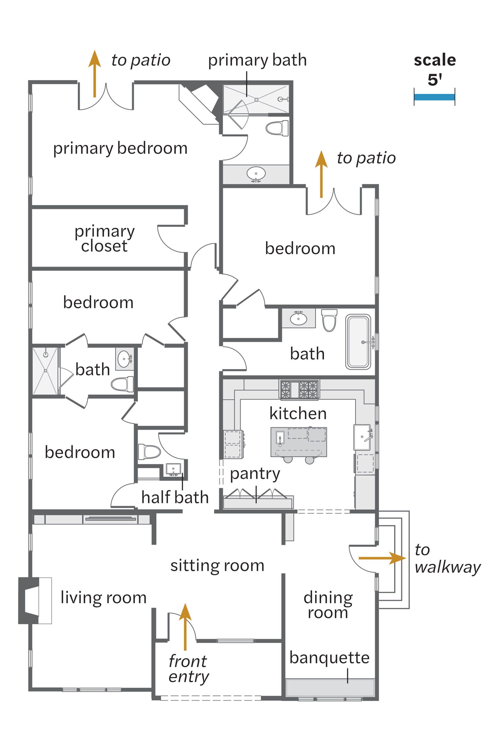
The Original Floor Plan

Built 100 years ago in a working-class neighborhood bordering the wealthy enclaves of Beverly Hills and Westwood, the one-bedroom, one-bath, single-story cottage had been renovated by a house flipper right before Karen and her now ex-husband bought it, gaining three bedrooms, two-and-a-half more baths, and 1,000 square feet.
“As a first-time home buyer, you’re like, ‘Oh, this is so luxurious!’” Karen recalls of the expanded footprint. But as years passed, the home’s shortcomings became more pronounced, and she could never figure out a way to make its old and new parts work together.
Recalibrating the Kitchen
The biggest drawback was the kitchen. Tucked into a corner of the house, the narrow galley layout was hampered by bottlenecks and a lack of counter space. “Once I put my toaster out, there was nowhere to chop broccoli,” Karen ruefully recalls.
Most importantly, the room felt like an afterthought, and she wanted a kitchen that would be the literal and figurative center of her home—an inviting spot where her two kids could sit and do homework and friends could congregate while she cooked. And she wanted to accomplish that without moving walls or adding on.
Eventually, Karen turned to architect Jeff Troyer, who was able to assess the home’s problems the moment he walked through the door. “There was adequate space in the house,” he says.
A Bright and Open Layout

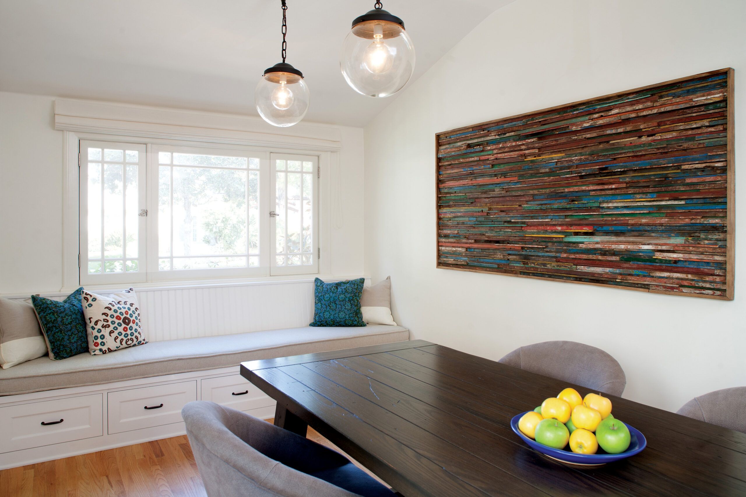
“It just needed to be rethought.” The dining room was centrally located but featured a deep, narrow pantry along an exterior wall that rendered the rest of the space windowless and uninviting. “It was so dark when we were eating, I hardly ever used it,” Karen says.
Troyer proposed moving the dining room to where the kitchen was and installing a new kitchen inside the old dining room. “If you removed the wall between the dining area and the pantry, the proportions of that space were really perfect for a U-shaped kitchen,” he says.

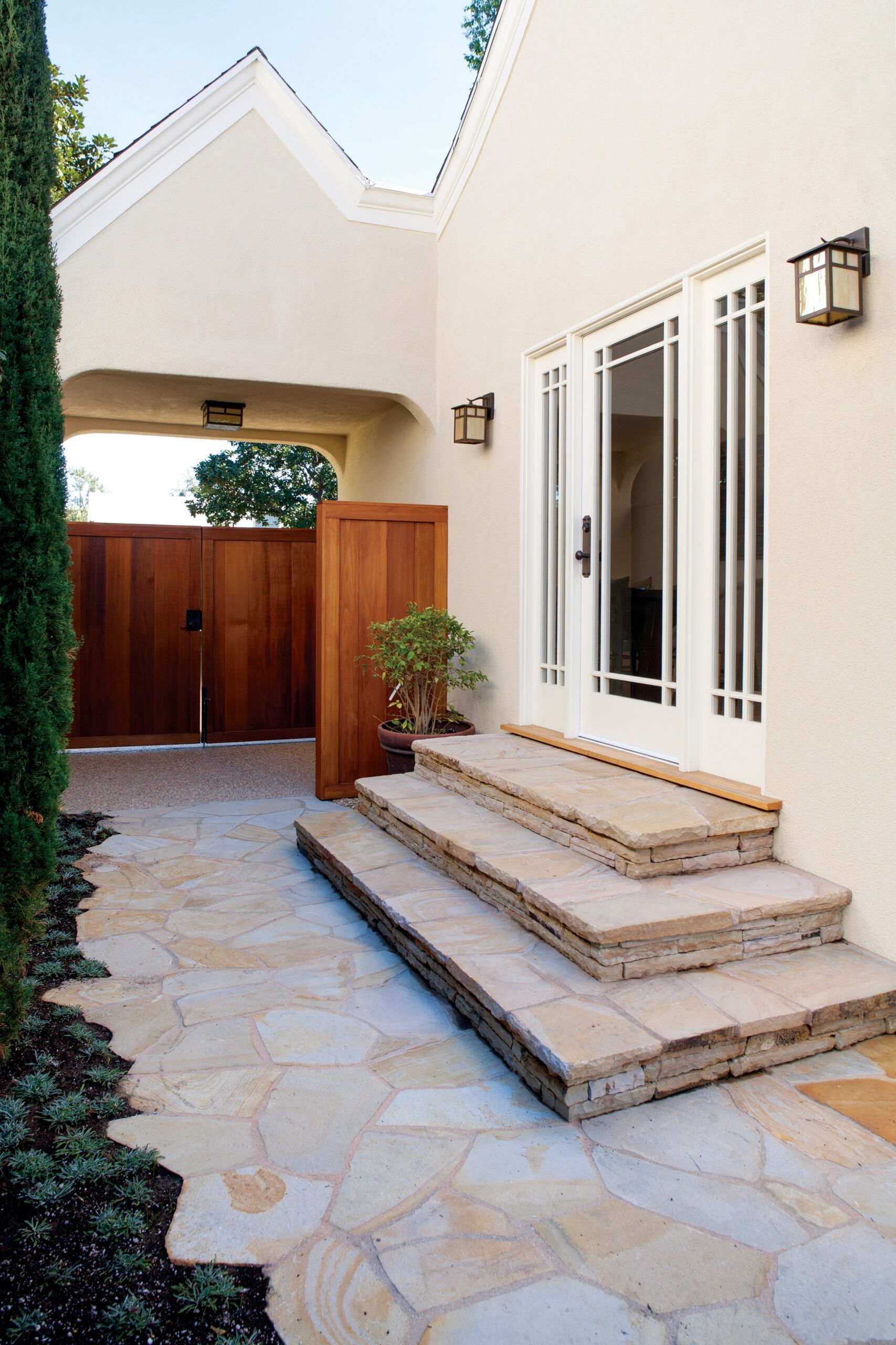
By relocating a side door and demolishing the pantry, Troyer was able to free up space for a wall of base cabinetry and appliances on either side of the sink, topped by three windows modeled after the home’s originals. “Adding the new windows has made it such a happy space,” says Karen. “I really appreciate the natural light every morning when I grab my coffee or take pictures of food for my Instagram” (@whatskarencooking).
The white Shaker-style cabinets were fitted with door panels divided by horizontal rails—a common detail in 1920s bungalows. Open shelves lit with wall washers give Karen a place to display her collection of California art pottery while adding a splash of color to the room’s neutral palette. Floor-to-ceiling cabinets anchor an opposing corner of the kitchen.
“There wasn’t room for an actual pantry, so I created this pantry cabinet for dish storage on the bottom and food storage on the top,” says Troyer, who stepped back the upper half to make the built-in look more like a piece of furniture.
Blend of Function and Aesthetics
Since Karen gives her counters a workout, she insisted on a material that would be durable and stain resistant. Troyer chose gray quartz, which tops the perimeter cabinets as well as the island—a rugged built-in crafted from stained alder that looks like it dropped out of a Montana ski lodge. “We wanted a more rustic look for the island,” Troyer says.
“With the all-white perimeter, the dark island really anchors the room.” A pair of stools mounted on brackets swing out from under the breakfast bar when they’re needed and tuck back in when they’re not, keeping the adjoining passageway clear. Steel posts hidden inside the island support the sitter’s weight.
The opposite side of the island conceals a wine fridge and a microwave drawer. “I hate having a big box on the counter,” Karen says. “I love that the microwave is in a drawer and out of sight.” Instead of installing a range, she opted for a cooktop augmented by a pair of French-door wall ovens, which are easier to access from the front (the open doors don’t block the passageway) and require less stooping.
The feature that earns the most attention, though, is the floor, whose existing oak floorboards were painted with a white checkerboard. “We wanted to separate the kitchen from the dining room,” Karen says. “I had seen some painted floors and just loved the idea.”
The pattern was laid out on the diagonal for visual interest and to make it easier to map out the squares, which were lightly sanded to let some of the wood grain show through—and make subsequent scuffs less noticeable. A sealer protects the surface.
The arched opening into the dining room holds a bookcase, which displays part of Karen’s collection of 300 cookbooks. “It was on my wish list to be able to organize, access, and display them better,” she says. A built-in banquette along the dining room’s end wall serves as a perch for diners while concealing storage for linens and overflow kitchen gadgets.
Finishing Touches Tie It All Together
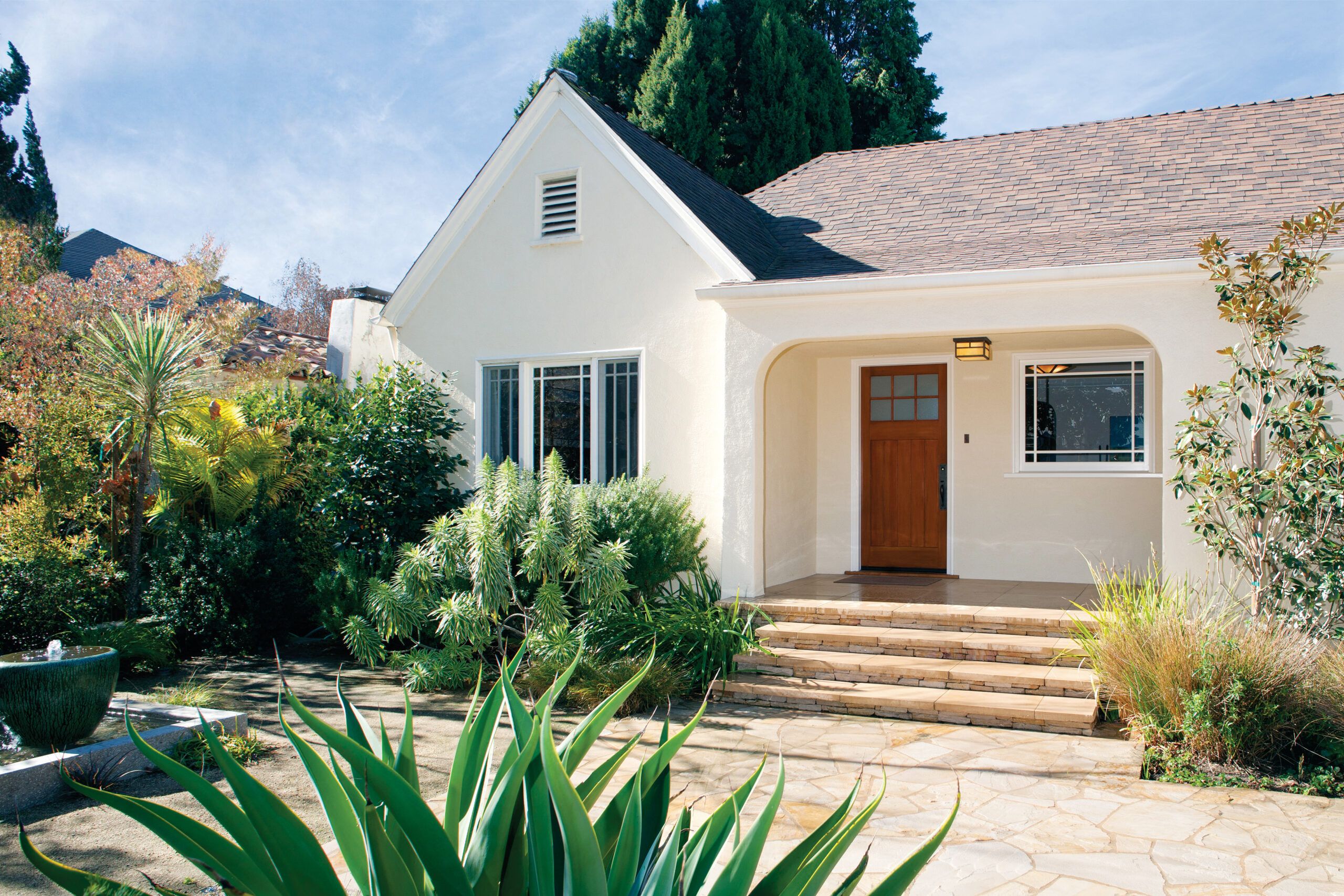
One of the most bewildering aspects of the old house was the presence of two front doors. “I wasn’t sure which one to go to,” Troyer recalls, echoing the sentiments of just about everyone who ever visited. One door opened into the living room, constricting seating there, while French doors opened into the middle of a large entry hall used as a TV room.
Troyer eliminated the entry door into the living room, freeing up more space for lounging, abetted by a wall-to-wall cabinet that holds a TV, bookshelves, and media equipment, which is secured behind perforated-metal doors for ventilation.
“Built-ins maximize the amount of usable space for us,” says Karen, noting that they take up less room than freestanding furniture performing the same function. Concealed lighting at the top of the built-in illuminates the cove ceiling, casting soft ambient light across the room, which retains its original fireplace adorned with antique Batchelder tiles.
Troyer replaced the French doors in the front of the house with a single Craftsman-style door that he shifted to one side, freeing up wall space inside for what is now a sitting room with a sectional sofa that faces a piano.
The earlier addition may have more than doubled the home’s living area, but it didn’t reflect the home’s period character. “We could see where some cheap decisions were made,” says Karen, citing the inexpensive stock baseboards that replaced the original tiered waterfall design still visible in the living room. With Karen’s blessing, Troyer had the originals duplicated and installed throughout the house.
Similarly, the entrances to the kitchen were arched to match original passageways, and a bland fire- place in the primary bedroom was dressed with a Craftsman-style mantel and tilework, consistent with the fireplace in the living room. Contemporary light fixtures and furnishings offer a lively counterpoint to these period touches, allowing the house to reflect its 1924 roots while accommodating the way families live now, a century later.


